Bar graphs are used to plot the frequency of a categorical variable, with higher bars representing greater quantities. This graph will require having a categorical variable for group membership and a continuously scaled variable representing the dependent variable.
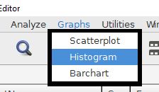
Begin by choosing the barchart option from the graphs drop-down menu.
The continuously scaled variable must go into the "bars represent" field. The categorical variable that will represent the bars goes into the "category axis" field. There are several statistical options to choose from for the bars, with means being the most common analysis.
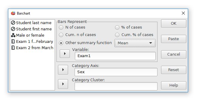
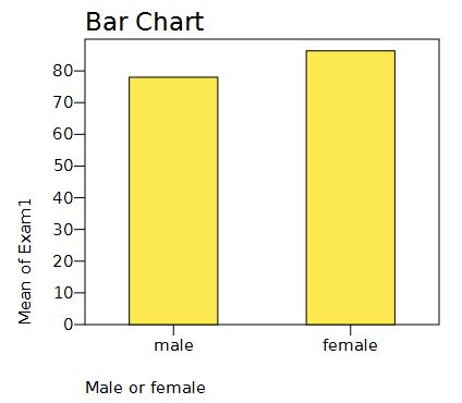
For this analysis, the bars will represent the means of Exam 1. The categories are from the Sex variable. This graph will have separate bars that represent the Exam1 means for males and females. The output looks like this:
Home | Start | Variables | Data | Descriptive | Relationship | Inferential | Effect size | Advanced | Video
This work is licensed under a Creative Commons Attribution 4.0 International License that allows sharing, adapting, and remixing.