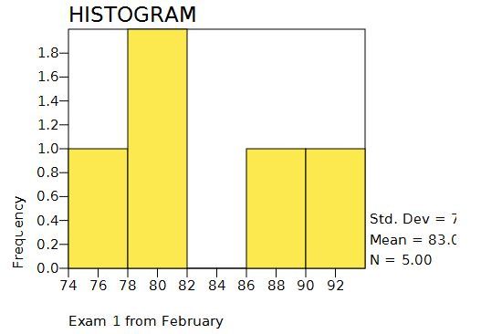
Histogram graphs have a continuous variable on the X axis for the scores. Higher quantities are represented by taller bars for each class interval.
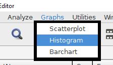
The histogram command is accessed from the graphs menu.
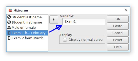
The next step is to choose the desired variable from the list of variables.
A histogram of Exam1 from the sample data file is shown below.
Most of the PSPP graphing capabilities are rather basic. Advanced graphing features might require other software.
Home | Start | Variables | Data | Descriptive | Relationship | Inferential | Effect size | Advanced | Video
This work is licensed under a Creative Commons Attribution 4.0 International License that allows sharing, adapting, and remixing.