Pie charts are used to depict the proportion or size of a subgroup. These help us to understand the relative size of each category.
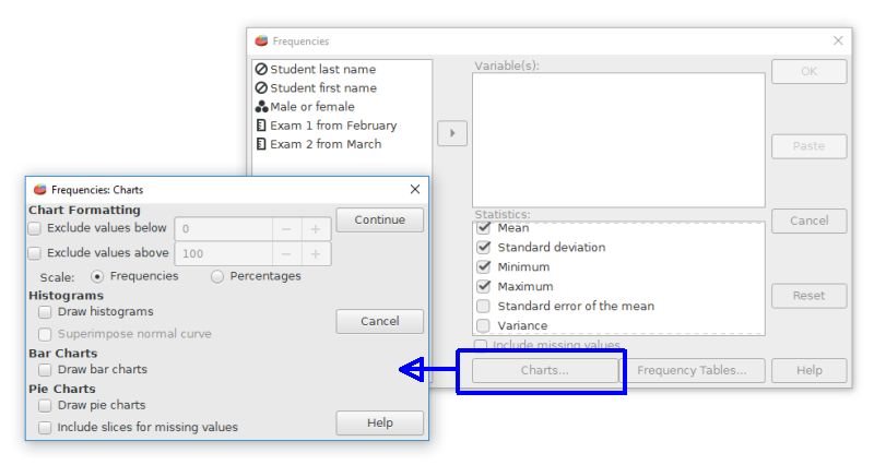
PSPP's options for pie charts are not in the graph menu. Instead, use the frequencies command (Analyze > Descriptive Statistics > Frequencies). Click on the "charts" button of the Frequencies dialog box to reveal a pie chart radio button.
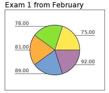
A basic pie chart from the Frequencies command will look like this example. If this is a categorical variable (nominal scale), it will be important to use the value labels feature for the variable in the data editor - variable view. The values recorded for the codes will be used to label the pie slices.
Home | Start | Variables | Data | Descriptive | Relationship | Inferential | Effect size | Advanced | Video
This work is licensed under a Creative Commons Attribution 4.0 International License that allows sharing, adapting, and remixing.