Gary Fisk's Blog

garyfisk

Just another HTMLy user

  • Posted on

    Note: This was first published on March 20, 2020. It was advice for educators who needed to rapidly move course content online during the COVID pandemic.

    There are several possibilities for adding narration and other forms of multimedia to PowerPoint presentations.

    To begin, the right hardware is needed: A microphone for capturing voice and a webcam for video. Most laptop computers have these features built-in, but some desktops may be lacking this hardware. Webcams that include microphones are inexpensive (about $30) if your computer does not have microphone or video capture capabilities.

    The most basic software option would be to use the presentation recording options in PowerPoint. These can be accessed using the “record slide show” option of the “slide show” tab. When a recording is started, PowerPoint will capture narration plus slide transitions, pen annotations (control-p), and laser pointer effects (control-left mouse button). The resulting multimedia presentation can be saved as a PowerPoint file. Another option is to export the narrated PowerPoint file to video (file > export > video) for sharing.

    The recording and editing features of PowerPoint are limited. Techsmith’s Camtasia offers more powerful options for combining presentations with webcam video and audio. Similarly, OBS Studio is a free, open-source application for capturing and editing multimedia. - Camtasia - OBS Studio

    Adding audio and video to a presentation has a “wow!” factor, but there are some important downsides to consider. Multimedia requires a lot of data, resulting in large files. People with slow or unreliable internet connections could have difficulty accessing these files. If the presentation is shared as a PowerPoint file, the viewer will also need to have PowerPoint software to open the file. This can be problematic because not everyone has this software due to the expense. Finally, the creation of files with audio and video can be technically demanding and labor intensive for the presenter.

  • Posted on

    Note: This was first published on March 16, 2020.

    When moving traditional class content online, it might seem reasonable to simply upload existing PowerPoint presentations to a learning management system and call it a day. However, most PowerPoint presentations are designed to supplement a spoken presentation. The PowerPoint content of most presentations – bullet points of key terms – may not be enough for novice learners.

    One way to overcome this problem is to use the “notes” feature to write short descriptions of the essential ideas from each PowerPoint slide. The aim is to add important information that would ordinarily be spoken. The slides plus notes can then be shared with students by printing the file to a .pdf format (portable document format) for sharing on a learning management system.

    Author view: This is a PowerPoint slide with bullet points and an image.

    Print to pdf: This is the printing view showing the printer (pdf) and slides (notes pages) settings.

    Creating a pdf file for sharing with students is recommended because pdf files are easier to view than PowerPoint files. The hyperlinks to relevant information are preserved in the pdf file.

    There are other possibilities for adding the spoken component to a file that can be shared. The command “record slide show” from the “slide show” tab can capture voice with the slides, which can then be saved and shared. Software applications like Camtasia can add additional multimedia features, such as video. The downsides are that this approach is time-consuming and requires more technical expertise. It can also be problematic for students that don't have access to optimum technology.

    Good luck with your efforts to move course content online!

    I thank Ellen Cotter and Steve Haase for their helpful feedback on this idea.

    Please feel free to save or share the following files that describe this approach.

    Created: March 15, 2020 License: Creative Commons Attribution License 4.0 Gary Fisk, Ph.D., Professor of Psychology, Georgia Southwestern State University Author of Slides for Students, a book about teaching with PowerPoint

  • Posted on

    Note: This was originally published on March 5, 2020.

    Dichromatism is a form of color blindness in which one of the three cone receptor subtypes is missing or abnormal. There are three possible forms, which are protoanopia, deuteranopia, and tritanopia.

    It has been difficult for me to remember which name represents which form of dichromatism even though I have taught this topic for a long time. The names really didn't make much sense.

    Today, this mental block was resolved. Here's a way to remember these forms and their underlying issues.

    • Protoanopia: Proto means one or first, a synonym for primitive. These individuals are missing the long wavelengths, the L or "red" cones.
    • Deuteranopia: Deuter referring to second, like the word deuce. This refers to the medium wavelengths, the M or "green" cones.
    • Tritanopia: The Tri prefix means third. This represents the short wavelengths, S or "blue".

    This scheme is ordered 1, 2, and 3 for the long, medium, and short wavelengths, respectively. Problem solved!

  • Posted on

    Note: This was first published on March 5, 2020.

    Steve Haase and I recently published No Implicit-Explicit Racial Attitude Correlation in a White Sample from the rural South of the United States in the Journal of Articles in Support of the Null Hypothesis. Here's a quick overview of the paper.

    A consistent finding since the introduction of the Implicit Association Test (IAT) is that it correlates only weakly with explicit attitudes. The reason for the lack of a relationship is unclear. An early interpretation was that the near zero relationship is a sign of unconscious processing. There are other possibilities though, perhaps technical in nature.

    We hypothesized that a larger implicit-explicit correlation could be found if the explicit attitudes were more extreme. A sample of white participants was collected from the rural South of the United States, a region with a history of black prejudice. They were tested on the Modern Racism Scale (MRS; explicit attitude) and a race IAT. The MRS scores were higher than a comparable sample from Pennsylvania, but this did not lead to a strong MRS-IAT correlation. The lack of an implicit-explicit relationship does not seem to be attributable to a restriction of range effect.

    We thank Stephen Reysen (the editor) and the reviewers for being open to publishing research that does not reach the traditional criterion for statistical significance.

  • Posted on

    Note: This was originally published on February 25, 2020.

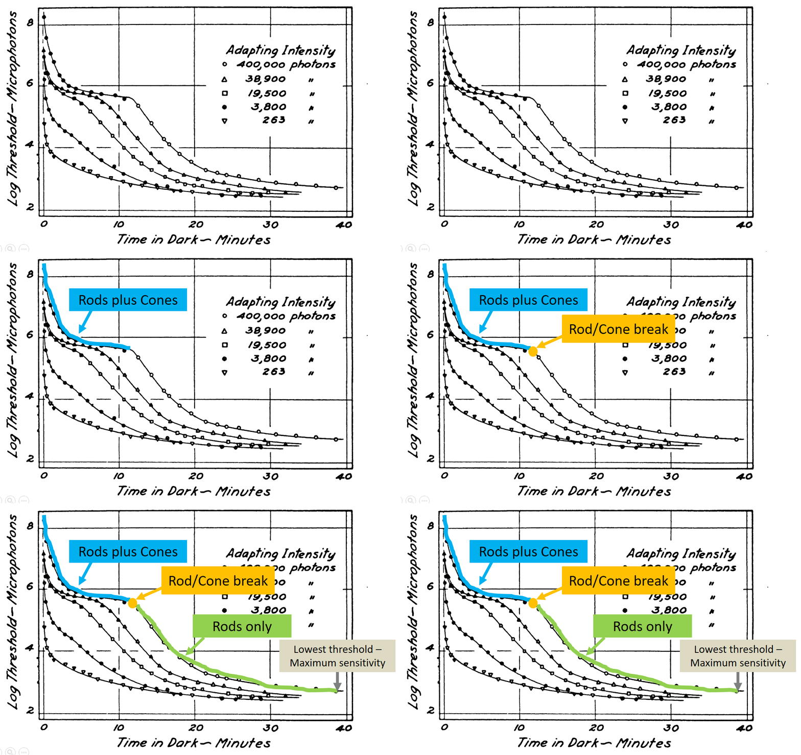
    Educators and scientists are often confronted with the challenge of information overload. Technical information is a critical part of the presentation, but the amount of information might overwhelm the audience. A solution for these situations is to walk the audience through a complex diagram with a series of on-click animations that direct audience attention to the relevant parts of the slide.

    The following example is a dark adaptation curve that illustrates how sensitivity to low light conditions increases over time. The plot shows a light energy threshold (the smallest amount of light that can be seen) as a function of time. The interpretation of the different plot components is progressively revealed to point out key features.

    Dark adaptation curve with animation to reveal key points (If you're interested in dark adaptation, here is the original PowerPoint file.)

    Some subtle features are worthy of further consideration. This slide has no additional text to interfere with or distract from the graph comprehension. Second, the graph labels are color coded to match the relevant parts of the curve and linked with the arrow. This associates the labels and the relevant parts of the curve via the Gestalt laws of similar and connectedness. Finally, the progression of reveal starts at the beginning of dark adaptation on the left, then follows the changes over time by working towards the right. This sequence follows the natural time course of dark adaptation.

    This carefully direction of attention should (hopefully!) help to make a complex technical figure more accessible to the audience.

    Source: Hecht, S., Haig, C., & Chase, A. M. (1937). The influence of light adaptation on subsequent dark adaptation of the eye. The Journal of General Physiology, 20(6), 831-850.

    License: Creative Commons Attribution 4.0 International

  • Posted on

    Note: This was originally published on January 30, 2020.

    Richard Dawkins has a great quote from Neil DeGrasse Tyson with an important insight into being a great educator. The context is that Dawkins has just given a critical presentation based upon impeccable facts. DeGrasse Tyson was concerned about the style of the presentation, so he offered the following constructive criticism.

    Being an educator is not only getting the truth right, but there's got to be an act of persuasion in there as well. Persuasion isn't always 'Here's the facts, you are either an idiot or you're not.' It's 'Here's the facts, and here is a sensitivity to your state of mind.' And it's the facts plus the sensitivity, when convolved together, creates impact. p. 262

    This combination of facts plus audience sensitivity is an excellent approach to take for every presentation.

    Source: Dawkins, R. (2015). A brief candle in the dark: My life in science. Harper Collins, New York

  • Posted on

    Note: This was originally published on January 30, 2020.

    Geoffrey James followed up his recent criticism of PowerPoint with another post entitled PowerPoint Has Its Defenders, But They're Wrong. In brief, his blog readers argue in favor of PowerPoint use, with some making arguments that are similar to mine. He shoots down these pro-PowerPoint arguments to maintain his position that PowerPoint has no redeeming qualities.

    This statement caught my eye:

    My most recent column explained that PowerPoint is a highly ineffective tool, because the premise on which it's based--that displaying words and images while you're talking improves audience retention--is scientifically invalid.

    This statement is only half true.

    The true part is that displaying words while the reader is talking can be problematic. The visual words and the spoken words must both be processed in the same brain area at the same time. The simultaneous processing of two information streams can't occur, so the audience must choose to focus on either the displayed words or the spoken words. This is a divided attention problem.

    The false part is the suggestion that PowerPoint images are also harmful. Some scientific evidence is exactly the opposite. Dual-coding theory suggests that words (spoken for presentations) and images can combine in a complementary way to support each other and improve learning. Some decorative images might be a distraction, but it is an overstatement to think that all images are harmful to comprehension.

    Here's a quick thought experiment. A friend of yours has recently traveled to some exotic location on a vacation trip. They're telling you now, in some detail, about their trip. Would you prefer to hear a verbal-only description of the trip or a verbal description plus selected pictures? The latter option would surely be more interesting and informative. In a similar manner, carefully chosen images can be helpful to presenters.

    So don't throw PowerPoint into the garbage can. A well-constructed PowerPoint presentation can offer valuable support to the message that you're trying to convey.

  • Posted on

    Note: This was originally published on January 24, 2020.

    Geoffrey James recently published opinion articles proposing that PowerPoint use should be rejected. In It's 2020. Why Are You Still Using PowerPoint? he argues that PowerPoint is ineffective and hated by everyone. In the article Jeff Bezos, Mark Cuban, and Tony Robbins Don't PowerPoint. They Do This Instead he recommends presentation approaches that deliberately avoid PowerPoint. This negative opinion of PowerPoint is similar to numerous critics such as Edward Tufte and many others.

    The issues raised by PowerPoint critics should always be seriously considered. These are very real problems. James is correct in saying that media comparisons studies (i.e., PowerPoint vs. chalkboards and other technologies) done by educators and cognitive psychologists don't show much of a learning boost from PowerPoint (see my book for a thorough review). In addition, it is well-known (to cognitive psychologists anyway) that the text on a slide can compete with the words that the presenter is speaking, thereby creating a divided attention problem. What is more important to the audience, the text on the slide or the words the speaker is saying? This competition between displayed text and spoken words can detract from a speaker's message.

    Although important points are raised, I disagree with this excessively negative view of PowerPoint. Here are a couple of counterpoints to consider.

    There is an extensive literature in educational psychology showing that graphic images can foster the understanding of complex topics. Dual coding theories suggest that the combination of words plus instructional images can have a synergistic effect that promote learning. This is particularly true in the STEM areas, where understanding topics like "How does the heart work?" require words like key terms plus a mental visualization of the processes. There is still research work to be done in this area. It's not fully understood why graphic images are sometimes helpful for learning but sometimes are ineffective. Similarly, it's not well understood why some images promote audience interest while others may be distractions that harm a presentation.

    A second point to consider is that PowerPoint is a technology. When bad presentations occur, it's the presenter who should be blamed, not the technology. Most people receive little to no training in how to give presentations. Their only training may have been a speech class in high school or college. The average person rarely gives presentations, so they have few opportunities to improve their presentation skills. Finally, most people are anxious or even terrified of speaking in public. For these people reading text off a PowerPoint slide is the easiest way through a situation that they dread and are poorly prepared to perform.

    An analogy is helpful for illustrating this point. Let's imagine an artist who spends a lot of money to get the best possible paints, brushes, studio space, and other equipment. However, this artist has no training, rarely paints, and didn't have much artistic talent to begin with. They maybe even dread the painting process! The end result will be mediocre to poor art. It would be a logical error to blame the brushes and other equipment for this artistic failure. The person is at fault here. This judgment seems reasonable for art, but when it comes to presentations somehow the technology receives most of the blame rather than the presenter. (It's important to note that this analogy isn't really mine. The artist and musician David Byrne has made a similar comparison between art and PowerPoint presentations.)

    In closing, I think Geoffrey James and similar critics are being excessively negative. PowerPoint adds value to a presentation when it is carefully designed to support a speaker's message. Furthermore, the proposed solutions like "go entirely slide-less" are unrealistic for the average presenter. It would be more helpful to follow-up known PowerPoint presentation problems with constructive solutions. What we really need is more training in how to give a good presentation and a better understanding of how PowerPoint works (or doesn't work) for an audience rather than simple suggestions to completely drop the use of PowerPoint.

  • Posted on

    Note: This was originally published on January 21, 2020.

    Last week, I saw a presentation on vegetable gardening given at a local Kiwanis club meeting. The presenter's interest in growing vegetables was inspired by gardens seen during mission trips abroad as well as the health benefits of eating more vegetables. He showed his raised bed system with automated watering and other nice features. It was an inspirational presentation. I left wanting to plant some veggies!

    During PowerPoint presentations I often have two tracks of thought. One track is about the presentation content. The other track is a process thought: What is working (or not working) about this presentation?

    This presentation clearly worked well in part because the presenter was intelligent, well-informed, and very passionate about the subject. Another important aspect though was the PowerPoint presentation. The presentation had very few words. The PowerPoint content was mostly a picture slide show of gardens, with healthy vegetable plants and happy gardeners. The images supported the presentation content and helped to illustrate key points. The slides promoted audience engagement largely because of the heavy use of educational images rather than text or bullet points.

    The take-home PowerPoint thought is that images (not text) are the most engaging for a non-technical, non-academic kind of presentation.

  • Posted on

    Note: This was originally published on a different platform, January 10, 2020.

    A student who recently gave a PowerPoint presentation in my class was aiming for an industrial-type appearance in his slides. The background was sliver with black holes. The image looked like a kitchen colander, but flat. The font was small and black.

    The overall appearance was similar to this: This PowerPoint slide is hard to read due to small black text on a very busy background of grey dots.

    This slide design fails on a sensory level. The background image has grey and black that is similar to the font, leading to a low degree of contrast between the text and the background. The image is very detailed, which produces a noisy feeling. Finally, the text is simply too small to be seen from a distance.

    An important design principle for sensory success is to have a high degree of contrast between the foreground (text) and the background. Our visual system works by detecting the degree of difference. Thus, designs that decrease contrast can be difficult to read or understand.

    Credit: The background image was based upon a free image from the following source. https://www.peakpx.com/637287/rubber-grid-regularly-floor-mat-backgrounds-silver-colored