- Posted on
- Featured Image
-
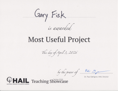
A previous post how to build your own artificial intelligence (AI) detector. This was partly done for an on-campus event, a teaching showcase for sharing teaching tips. The presentation won the "most