Gary Fisk's Blog

garyfisk

Just another HTMLy user

  • Posted on

    Note: This was first published on October 20, 2021.

    PowerPoint has a special screen for presenters that shows the slides plus a variety of control buttons and a clock. Accessing this feature requires an extended screen setting. Unfortunately, the concept of an extended screen is difficult to understand and explain. This confusion is understandable because the extended screen is invisible!

    The following is an explanation of the difference between duplicate vs. extended screens.

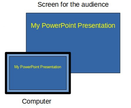
    The duplicate setting shows the same presentation on the presenter’s computer and the audience’s screen. Duplicate could be understood as the standard mode of operation. Duplicate screen illustration: The computer and audience views are the same.

    Think of the extended screen as being an imaginary monitor positioned just to the right of the computer display. Presenters can move windows (see video in green) to the extended view by dragging them to the right, from the computer desktop to the invisible extended display. Extended screens can be understood as an enhanced display space just for the audience. The extended screen is an imaginary screen located to the right of the computer display. Diagram that illustrates how the extended screen works

  • Posted on

    Note: This was first published on March 22, 2021.

    Like many educators, my pandemic classroom presentations have been split between in-person, classroom students and students who are watching online through video technology. The challenge is that interacting with the online audience is much harder than the classroom. My technology shares the screen (a PowerPoint presentation), but does not provide a live video during the presentation when the screen is shared. Unfortunately, watching a PowerPoint presentation with just a voice is a bit dull.

    An easy way to make the online presentations a bit more interesting is to use the annotation tools during the presentation. The tools are used to add or mark-up the existing presentation. The online students get to watch the presentation growing in a more dynamic way. It's like turning the presentation into a basic chalkboard, a time-tested teaching tool.

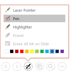
    The annotation tools are available by hovering the mouse over the lower left corner of the presentation. These features can also be accessed by keystrokes: control-p for pen and control-l for laser pointer. Here's the pop-up menu:
    Annotation pop-up menu appearance

    Marking up the slides has been fun and dynamic when done live. On this slide, I added that a stage-based theory of human growth has step-like qualities by drawing the following on the screen with the mouse while I'm talking. This is an example of a PowerPoint slide with annotations that show a visual relationship. The annotated slides can be saved, exported to a pdf file, and shared with students.

    A related issue is that the people watching a shared computer screen at home can't see a laser pointer on the classroom screen. So, I've stopped using the laser pointer in my wireless presentation remote. Instead, the PowerPoint laser pointer is used so everyone - home and classroom - can see it.

    These built-in features are an easy way to bring at least a tiny bit of extra life to a static, shared screen presentation. They are very useful, yet underappreciated. Give it a try in your next online presentation.

  • Posted on

    The Americans with Disabilities Act (ADA) standards for online video require closed captions. Manually adding the captions is possible, but it is challenging and time-consuming. Fortunately, there are some built-in Brightspace features that make it easy to add captions. The following instructions and example are from the discussion tool feature.

    1. Getting started: Create a discussion thread. Position the cursor to the desired location for the video. Choose the "insert stuff" icon from the editor toolbar.

    2. Create the video: Chooose "add video note." Use "new recording" to make a video. If needed, allow access to your camera and microphone. Click the "next" button to accept the video and proceed to the final steps. Screenshot of the insert stuff button

    3. Add processing options: Add a title and a description. Key steps: Select the audio language from the drop-down menu and check the "automatically generate captions from audio" radio button. enter image description here

    4. Processing: Brightspace will state "The file is currently being processed." Wait until processing is finished, then preview the video. Press the "insert" button to place the video into your discussion post. Click the "post" button to make the newly created video public on the discussion board.

    5. Use: The captions can be turned on or off via the setting gear icon in the lower right corner. enter image description here

    Brightspace provides a list of languages that can be used with this feature.

    This blog post from Xavier University describes another method for existing videos: Audio/Video Note Editor from Admin tools.

  • Posted on

    Note: This was first published on March 5, 2021.

    Transparency is a hot idea in higher education. The idea has multiple dimensions, but here we will focus on the essential "transparent" component: The need to clearly communicate the purpose of course activities to students. Why are we doing this assignment? What is the motivation? How does the current assignment connect to ideas that have already been covered? What skills will students gain by performing this task? Unfortunately, these important motivation-related questions are often not addressed. These critical ideas may be assumed by the professor rather than being explicitly stated.

    The transparency movement has focused largely on assignments, with tilthighered.com having numerous examples. My contribution is that the transparent idea could be easily extended to PowerPoint presentations. The typical classroom PowerPoint presentation has excellent facts and information. The problem is a missing 'why?' explanation. The importance or purpose might be obvious to faculty experts, but novice learners may be largely unaware of why they should care about a particular topic.

    The introduction is an ideal time to address 'why' questions. The motivational questions - why should we care? - should be addressed before launching into the facts and key terms to properly prepare students. The possibilities include ...

    • The question: Have you ever wondered why people do/think ______? Let's explore why this occurs.
    • Establishing context: How does today's topic relate to the ideas from the last course meeting? This is how today's topic fits into important course goals.
    • Personal relevance: Today's topic will be essential for your life or career in this way. This presentation will help you gain an expert understanding that is useful for _____.
    • History: A long-standing concern in our field/society is ______. Today, we will investigate three different attempts to address this issue.

    The 'why' possibilities may be nearly infinite. The general aim is to address why anyone should care or find this topic interesting. A second important goal is helping students form connections between today's topic and previous topics or upcoming topics.

    Like transparent assignments, taking just a few minutes at the beginning of a presentation to address these 'why?' questions can have a big impact. It is not necessary to overhaul everything in a PowerPoint presentation to gain the benefits of transparency. One or two slides at the beginning to promote motivation and establish context can be helpful to novices.

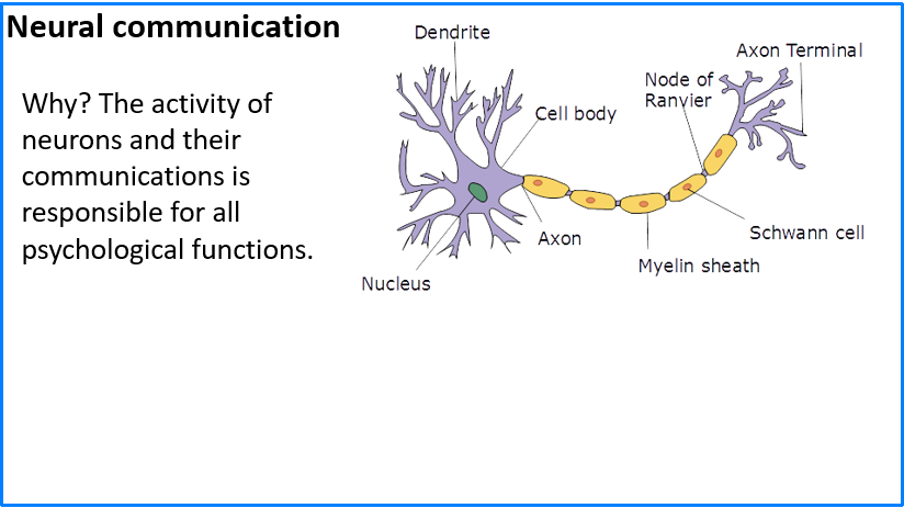
    The transparent opening can even be a part of the slide design. Norman Eng has suggested a one sentence takeaway or mission statement. Here's an example from an opening slide in my Introductory Psychology course.

    An introductory slide with a one sentence purpose statement

    I hope this idea has been helpful. Please consider sharing good ideas for transparent openings in PowerPoint presentations.

    Image credit https://commons.wikimedia.org/wiki/File:Neuron.svg User: Dhp1080, CC BY-SA 3.0 http://creativecommons.org/licenses/by-sa/3.0/, via Wikimedia Commons

  • Posted on

    Note: This was first published on February 2, 2021.

    The Impact of Multi-Media Presentation Format: Student Perceptions and Learning Outcomes by Katherine Moen, University of Nebraska Kearney (Note: This is the second post in a series of PowerPoint-related presentations from the Psychonomic 2020 meeting.)

    An important issue for educators is the value of text vs. images in PowerPoint presentations. Do people learn best from words or images? How many words are too many words? Academic PowerPoint presentations tend to be text-heavy. On the other hand, images may be information-rich ('a picture is worth a thousand words') in ways that add a visual-spatial component to the spoken presentation.

    This in-class study compared students who received standard PowerPoint slides (text plus small images) to student who received slides that were mostly images. The picture-based group had a small (about 5%) increase in exam scores. Student interest and engagement was about the same in both groups.

    Commentary: This is a good illustration of how information-rich instructional graphics can be superior to text-focused slides. The results are consistent with Mayer's redundancy principle: Providing text on the slide that is essentially the same as the spoken presentation does not facilitate learning. Perhaps image-based slides require students to pay more attention to the spoken presentation, which then benefits learning. When the PowerPoint is mostly images, students could be more actively engaged or processing the lecture deeper than simply copying information from slides.

  • Posted on

    Note: This was first published on January 11, 2021.

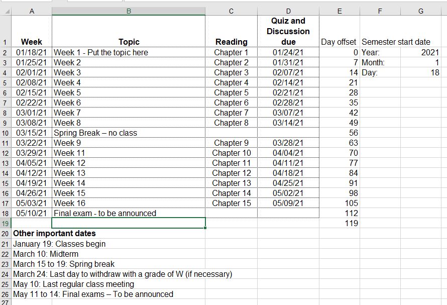
    This Excel file is a course calendar tool. Just enter the starting date of the semester and all the other dates will be automagically calculated! It speeds up the development of course calendars.

    Screenshot: enter image description here

    Download the tool.

    Instructions / tips for using the weekly calendar:

    1. The year, month, and day in the upper right corner are the anchor points for all calculated dates. Start by entering this information.

    - The day field should start on a Monday. - Default: The week calculations have Mondays for the start of the week. - Default: The due calculations assume that all assignments are due on Sundays. 2. The day offset values increase each week by seven days.
    - The offset values can be customized. For example, use 14 day intervals for every two weeks. - For holiday weeks, it is easier to simply enter "spring break" (or whatever) compared to eliminating a week and fiddling with the day offset values.
    3. The due date formula for Sundays is +6 from Monday (the start of the week).
    - The due date can be adjusted. For example, Friday due dates could be set by using +4 rather than +6. 4. Enter the weekly topics and other special date information.
    5. Create a finished calendar for students by selecting the important cells and printing the selection to a .pdf file.

    Good luck with your courses!

  • Posted on

    Note: This was first published on December 15, 2020.

    Steve Haase and I have been studying the difficult scientific topic of unconscious perceptual processing for over 20 years. Many experimental psychologists are of the opinion that perception must be largely unconscious, yet efforts to divide consciousness and isolate unconscious processing have often been inconclusive.

    A key methodological issue is how to separately measure awareness and perception. The standard approach is to use two different tasks, but using two tasks may create interpretational problems. In this work, we attempted a single-task approach. It was hypothesized that overall lexical decision response times would be sensitive to prime awareness, whereas response time differences on incongruent vs. congruent trials would provide evidence of perceptual processing. The results were mixed between the two experiments, with only the first experiment offering clear support for the single task hypothesis.

    The second hypothesis is that prime words or nonwords would produce nonassociative priming effects on lexical decisions (word vs. nonwords) for the target stimuli. In other words, trials with prime-target matches (word - WORD or nonword - NONWORD) would show facilitation. Both experiments showed strong stimulus congruency effects, thereby supporting nonassociative priming.

    After several rejections, we have decided to publish this work online without peer endorsement. The public availability of this document will promote open science and transparency. Perhaps this effort may be useful to other investigators in this field.

    The manuscript, a statement, and supporting data are available at the following web site: https://osf.io/62yf3/

    Abstract: Most studies of unconscious perception are based upon two tasks for separately assessing perception and awareness, which may create an interpretational problem. The present experiments were performed to test the possibility that lexical decision priming might show evidence of both perception and awareness in a single task. A randomly chosen word or nonword prime stimulus was briefly displayed (17 to 100 ms), then immediately followed by a randomly chosen word or nonword target for the lexical decision task (word vs. nonword discrimination). Experiment 1 nonwords had only consonant letters (no vowels – impossible nonwords), whereas Experiment 2 nonwords had consonant – vowel patterns (word-like nonwords). A response congruency effect was obtained in both experiments. Strong evidence of a processing delay caused by conscious awareness of the prime stimulus (longer overall response times) was not obtained for the long prime duration conditions. Nonassociative congruency effects may provide some methodological advantages over classical masked semantic priming, especially when the word and nonword stimuli are dissimilar.

  • Posted on

    Note: This was first published on September 25, 2020.

    Students often feel a compulsive need to write down the text from PowerPoint presentations. This is modern note-taking: a simple verbatim copy of the presented text. Their aim is to capture information that might be on future exams and store this information for future studying. The downside is that mere copying is a very passive learning approach and a distraction from what the teacher is actually saying.
    This week, I witnessed a new form of text copying that was surprising. (It was new to me, anyway.) It may be informative to people who teach with PowerPoint.

    The setting was a peer-observation of another faculty member. I was seated in the back corner of the classroom. The PowerPoint presentation had numerous key terms with complete definitions. The slide deck was available both on screen and online through the learning management system. Two students with laptop computers were seated near me with screens that could be easily seen. They had the learning management system open with the presentations loaded up. They seemed to be working hard on taking hand-written notes. So far, so good. The initial appearance was standard, college-level educational practices.

    The surprising part was that the students were actually two or three slides ahead of the presenter! They were copying information from the online PowerPoint because the amount of presented text was apparently too much to copy down in real time. Their solution was to copy text from the online presentation in advance of the actual presentation. Sadly, the spoken presentation was being ignored.

    This copying ahead of the presentation is a misguided learning strategy. It could be prevented by not providing the PowerPoint files online, but this solution misses a bigger problem. The more critical issue is that providing numerous key terms and definitions via a PowerPoint presentation is overwhelming to students. The definitions could be learned from a textbook, so there is really no need for these details in an educational presentation. Instead, educational presentations need to focus on broad ideas and instructional graphics that foster understanding instead of providing definitions.

  • Posted on

    Note: This was first published on May 7, 2020.

    The news lately has been full of statistical concepts relating to the COVID-19 virus crisis. "Flattening the curve" has become a commonly used term. Critical decisions such as reopening businesses are being based upon testing results. Here's my take on these virus-related statistics based upon my nearly 20 years of teaching introductory-level statistics classes.

    Statistics for small groups is pretty straight-forward: Test everyone and then calculate averages, make graphs, or do other summary statistics. This is called descriptive statistics. The simple goal is summarizing or describing what a group is like. An example might be a teacher summarizing the results of an exam by calculating a class average. This use of statistics is fairly simple to understand and interpret.

    A more difficult situation occurs when we study small groups of people (samples) that are drawn from much larger groups of people (populations). This is called inferential statistics. We usually study samples of people because most populations are simply too large to study. For the virus situation, it would be impossible to simultaneously test 300+ million people in the United States at the same time. Visual representation of sampling from a population

    The above diagram illustrates this inferential statistics process. The large population (left circle) represents everyone in our society who may or may not have the virus. This is too many people to test, so we must settle for testing smaller samples (right circle). The conclusions from this sample group are presumably true for the population.

    Studying samples gets around the practical problem of studying millions of people. However, the risk is that the conclusions may be inaccurate. A crucial feature is that the sample must accurately represent the population, like a miniature version of the population. In the above diagram, the population has many colors to represent the variability of people in the population. Illustration of a biased sample

    This second diagram represents a biased sample. It illustrates how a small sample might be quite different from the population that it was drawn from. The population has many colors, but the sample is only blue. Any conclusions made from this sample might be quite misleading because of the biased sample.

    We are seeing some of these sampling limitations in the current COVID-19 virus crisis. The key question is how many people have been infected? The official numbers come from small samples due to the limited availability of testing kits. Only the sickest patients are being tested in many parts of the country. There is also the issue of false negatives: people who are disease carriers yet pass a virus test without showing signs of the disease.

    Taken together, these issues suggest that the official numbers are underestimated. The true number of people who carry or die from the virus is likely higher than the official numbers. We don't really know for certain how many people have the virus in the population. It's a fuzzy picture of what's actually occurring. This statistical perspective is important to keep in mind when you see news stories about the number of people who have been infected.

    Update: July 2, 2020

    Several studies have been published since this blog post about the underestimation of cases. From Weinberger et al. (2020): "Official tallies of deaths due to COVID-19 underestimate the full increase in deaths associated with the pandemic in many states." The New York Times also has this nice summary of research from the CDC: "The number of coronavirus infections in many parts of the United States is more than 10 times higher than the reported rate, according to data released on Friday by the Centers for Disease Control and Prevention."

  • Posted on

    Note: This was first published on April 7, 2020.

    I recently had the opportunity to help seven undergraduate students prepare for a presentation at a regional conference. These people are some of our best students. Four out of the seven students had slides that looked like this: Slide with white text on a light blue background

    White text on a colored background becomes nearly invisible in our classrooms. It's washed out. Turning off all of the overhead lights doesn't help very much. There is too much ambient light coming in from the windows and an emergency overhead light that cannot be turned off.

    The slides that had black text on a light background had much better visibility. It's a better sensory combination for most classrooms.

    Slide designs and color combinations that look good on your office computer can completely fail during a presentation. The only way to be sure is to test the appearance in the classroom.