- Posted on
- Featured Image
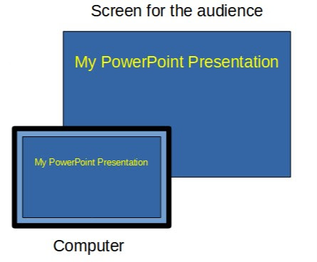
Student message: "I was absent [due to a medical problem]. Do you mind sending me the PowerPoint/notes that were taken during that day?" Students often refer to PowerPoint presentations as being